 |
|
How does a Smith chart work? A venerable calculation aid retains its allure in a world of lightning-fast computers and graphical user interfaces. By Rick Nelson, Senior Technical Editor | |
|
|
The Smith chart
appeared in 1939 (Ref. 1) as a graph-based method of simplifying the
complex math (that is, calculations involving variables of the form
x + jy) needed to describe the characteristics of microwave
components. Although calculators and computers can now make short work of
the problems the Smith chart was designed to solve, the Smith chart, like
other graphical calculation aids (Ref. 2), remains a valuable tool.
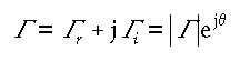
Smith chart inventor Philip H. Smith explained in Ref. 1, “From the time I could operate a slide rule, I’ve been interested in graphical representations of mathematical relationships.” It’s the insights you can derive from the Smith chart’s graphical representations that keep the chart relevant for today’s instrumentation and design-automation applications. On instruments (Ref. 3), Smith chart displays can provide an easy-to-decipher picture of the effect of tweaking the settings in a microwave network; in an EDA program (Figure 1), a Smith chart display can graphically show the effect of altering component values. Although the Smith chart can look imposing, it’s nothing more than a special type of 2-D graph, much as polar and semilog and log-log scales constitute special types of 2-D graphs. In essence, the Smith chart is a special plot of the complex S-parameter s11 (Ref. 4), which is equivalent to the complex reflection coefficient G for single-port microwave components. Note that in general,
and that | G |ejq is often expressed as G/u. Note that this latter format omits the absolute-value bars around magnitude G; in complex-notation formats that include the angle sign (/), the preceding variable or constant is assumed to represent magnitude. Figure 2 shows the specific case of a complex G value 0.6 + j0.3 plotted in rectangular as well as polar coordinates (0.67/26.6°).
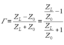
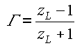
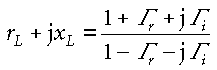
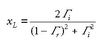
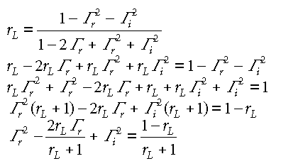
Why the circles? That’s all well and good, you may say, but where do the Smith chart’s familiar circles (shown in gold in Figure 1) come from? The outer circle (corresponding to the dashed circle in Figure 2) is easy—it corresponds to a reflection coefficient of magnitude 1. Because reflection-coefficient magnitudes must be 1 or less (you can’t get more reflected energy than the incident energy you apply), regions outside this circle have no significance for the physical systems the Smith chart is designed to represent. (Editor's note: Please see the letter to the editor at the bottom of this page.) It’s the other circles (the gold nonconcentric circles and circle segments in Figure 1) that give the Smith chart its particular value in solving problems and displaying results. As noted above, a graph such as Figure 2’s provides for convenient plotting of complex reflection coefficients, but such plots aren’t particularly useful by themselves. Typically, you’ll want to relate reflection coefficients to complex source, line, and load impedances. To that end, the Smith chart transforms the rectangular grid of the complex impedance plane into a pattern of circles that can directly overlay the complex reflection coefficient plane of Figure 2. Ref. 5 provides a Quicktime movie of a rectangular graph of the complex-impedance plane morphing into the polar plot of the typical Smith chart. The following section shows the mathematical derivation that underlies the Smith chart. In effect, the Smith chart performs the algebra embodied in equations 2 through 16. The algebra Recall that nonzero reflection coefficients arise when a propagating wave encounters an impedance mismatch—for example, when a transmission line having a characteristic impedance Z0 = R0 + jX0 is terminated with a load impedance ZL = RL + jXL Þ Z0. In that case, the reflection coefficient is In Smith charts, load impedance is often expressed in the dimensionless normalized form zL = rL + xL =ZL/Z0, so Equation 2 becomes
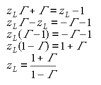
Equation 3 is amenable to additional manipulation to obtain zL in terms of G: Explicitly stating the real and imaginary parts of the complex variables in Equation 4 yields this equation:
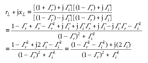
which can be rearranged to clearly illustrate its real and imaginary components. The first step is to multiply the numerator and denominator of the right-hand side of Equation 5 by the complex conjugate of its denominator,
thereby enabling a form in which real and imaginary parts are readily identifiable and separate:
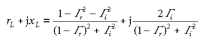
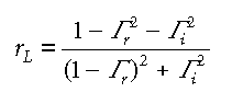
The real part is then
and the imaginary part is
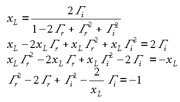
You can further manipulate equations 8 and 9 in the hope of getting them into a form that might suggest a meaningful graphical interpretation. Equation 8, for example, can be altered as follows:
The last line of Equation 10 might look familiar. It’s suggestive of this equation you might remember from high school analytic geometry:
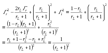
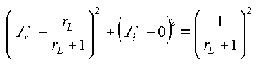
Equation 11 represents a circle plotted in an x-y plane with radius r and centered at x = a, y = b. In Equation 10, you can add rL2/(rL + 1)2 to each side to convert the G r terms into a polynomial that you can factor:
You can then arrange Equation 12 into the form of a circle centered at [rL/(rL + 1), 0] and having a radius of 1/(rL + 1):
Figure 3 shows the circles for several values of rL. Note that the rL = 0 circle corresponds to the | G | = 1 circle of Figure 2. You can similarly rearrange Equation 9:
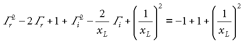
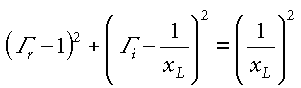
adding a constant to make the G i terms part of a factorable polynomial:
Equation 15 can then be written as follows:
representing a circle of radius 1/xL centered at [1, 1/xL]. Figure 4 shows several of these circles or circle segments for various values of xL. The segments lying in the top half of the complex-impedance plane represent inductive reactances; those lying in the bottom half represent capacitive reactances.
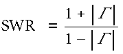
Note that the circle centers all lie on the blue G r = 1 vertical line. Only the circles segments that lie within the green | G | =1 circle are relevant for the Smith chart. Note that xL = 0 along the horizontal axis, which represents a circle of infinite radius centered at [1, +y] or [1, –y] in the complex G plane. You can superimpose the circles of Figure 3 and the segments lying within the | G | = 1 circle of Figure 4 to get the familiar Smith chart (Figure 5). Note that the Smith chart circles aren’t a replacement for the complex reflection-coefficient plane—in fact, they exist on the plane, which is represented in rectangular form by the gray grid in Figure 5. Now what? The coexistence of complex-impedance and complex-reflection-coefficient information on a single graph allows you to easily determine how values of one affect the other. Typically, you might want to know what complex reflection coefficient would result from connecting a particular load impedance to a system having a given characteristic impedance. Consider, for example, the normalized load impedance 1 + j2. You can locate the point representing that value on the Smith chart at the intersection of the rL = 1 constant-resistance circle and the xL = 2 constant-reactance circle segment; the intersection is point A in Figure 6. With point A plotted, you can directly read the resulting reflection coefficient: G = 0.5 + j0.5, or G = 0.707/45°. To graphically determine the polar form, simply divide the length of line segment OA by the radius of the rL = 0 circle. You can use a protractor to measure the angle; many Smith charts, such as one included in Adobe PDF format on a CD-ROM supplied with Ref. 6, include a protractor scale around the circumference of the rL = 0 circle. Such a scale is suggested in yellow in Figure 6. As another example, the complex-impedance value 1 – j1 is located at point B in Figure 6; at point B, you can read off the corresponding reflection coefficient G = 0.2 – j0.4, or G = 0.45/–63°. (Keep in mind here that this example describes dimensionless normalized impedances. For a system characteristic impedance of 50 W, the respective values of load impedances at points A and B would be 50 + j100 W and 50 – j50 W.) Standing wave ratio Smith charts can help you determine input impedances as well as relate load impedances to the reflection coefficient. To understand how that works, first review the operation of standing waves in a transmission line with a mismatched load. Such waves take on a sinusoidal form such as that shown in Figure 7a. In Figure 7, standing waves result when a voltage generator of output voltage VG = (1 V)sin(vt) and source impedance ZG drive a load impedance ZL through a transmission line having characteristic impedance Z0, where ZG = Z0 Þ ZL and where angular frequency v corresponds to wavelength l (Figure 7b). The values shown in Figure 7a result from a reflection coefficient of 0.5. I won’t derive the equation that describes the standing wave that appears along the transmission line in Figure 7b; for a derivation, see Ref. 5 or another text covering transmission-line theory. I’m asking you to accept that if you could connect an oscilloscope to various points along the transmission line, you would obtain readings illustrated in Figure 7c. Here, probe A is located at a point at which peak voltage magnitude is greatest—the peak equals the 1-V peak of the generator output, or incident voltage, plus the in-phase peak reflected voltage of 0.5 V, so on your oscilloscope you would see a time-varying sine wave of 1.5-V peak amplitude (the gray trace in Figure 7c). At point C, however, which is located one-quarter of a wavelength (l/4) closer to the load, the reflected voltage is 180° out of phase with the incident voltage and subtracts from the incident voltage, so peak magnitude is the 1-V incident voltage minus the 0.5-V reflected voltage, or 0.5 V, and you would see the red trace. At intermediate points, you’ll see peak values between 0.5 and 1.5 V; at B (offset l/8 from the first peak) in Figure 7c, for example, you’ll find a peak magnitude of 1 V. Note that the standing wave repeats every half wavelength (l/2) along the transmission line. The ratio of the maximum to minimum values of peak voltage amplitude measured along a standing wave is the standing wave ratio SWR. For the Figure 7 system, SWR = 1.5/0.5 = 3. Note that
I’m not proving Equation 17 here, but substituting the 0.5 reflection coefficient used in the Figure 7 example into Equation 17 does provide the desired result of 3. The relationship between G and SWR suggests that SWR might have a place within the Smith chart, and indeed it does. In fact, calculations involving SWR first prompted Smith to invent his chart. “By taking advantage of the repetitive nature of the impedance variation along a transmission line and its relation to the standing-wave amplitude ratio and wave position, I devised a rectangular impedance chart in which standing-wave ratios were represented by circles,” he explained in Ref. 1.
Figure 8 helps to explain how those circles arise. In Figure 8, point L represents a normalized load impedance zL = 2.5 – j1 = 0.5/18° (I chose that particular angle primarily to avoid the need for you to interpolate between resistance and reactance circles to verify the results). The relationship of reflection coefficient and SWR depends only on the reflection coefficient magnitude and not on its phase. If point L corresponds to | G | = 0.5 and SWR = 3, then any point in the complex reflection-coefficient plane equidistant from the origin must also correspond to | G | = 0.5 and SWR = 3, and a circle centered at the origin and whose radius is the length of line segment OL represents a locus of constant-SWR points. (Note that the SWR = 3 circle in Figure 8 shares a tangent line with the rL = 3 circle at the real axis; this relationship between SWR and rL circles holds for all values of SWR.) Using the standing-wave circle, you can determine input impedances looking into any portion of a transmission line such as Figure 7’s if you know the load impedance. Figure 7, for instance, shows an input impedance Zin to be measured at a distance l0 from the load (toward the generator). Assume that the load impedance is as given by point L in Figure 8. Then, assume that l0 is 0.139 wavelengths. (Again, I chose this value to avoid interpolation.) One trip around the Smith chart is equivalent to traversing one-half wavelength along a standing wave, and Smith charts often include 0- to 0.5-wavelength scales around their circumferences (usually lying outside the reflection-coefficient angle scale previously discussed). Such a scale is show in yellow in Figure 8, where clockwise movement corresponds to movement away from the load and toward the generator (some charts also include a counter-clockwise scale for movement toward the load). Using that scale, you can rotate the red vector intersecting point L clockwise for 0.139 wavelengths, ending up at the blue vector. That vector intersects the SWR = 3 circle at point I, at which you can read Figure 7’s input impedance Zin. Point I lies at the intersection of the 0.45 resistance circle and –0.5 reactance circle, so Zin = 0.45 – j0.5. Still going strong The Smith chart remains an invaluable aid for a variety of applications, from the design of impedance-matching networks to the determination of the feed-point impedance of an antenna based on a measurement taken at the input of a random length of transmission line (Ref. 7). Whether you are using it as a computational tool—as its inventor intended—or as the graphical interface to instrumentation or EDA software, it provides insights to circuit operation not available from the raw data that number crunching machines can produce from microwave component measurements and simulations. T&MW References 1. “Philip Smith, Electrical Engineer,” an oral history conducted in 1973 by Frank A. Polkinghorn, IEEE History Center, Rutgers University, New Brunswick, NJ. www.ieee.org/organizations/history_center/oral_histories/transcripts/smith3.html. 2. See, for example, “Parallel Resistance Nomograph,” www.tmworld.com/reference/nom_oddsends.htm. 3. Nelson, Rick, “Vector network analyzers grade microwave components,” Test & Measurement World, April 2001. p. 16. www.tmworld.com/articles/2001/04_VNAs.htm. 4. Nelson, Rick, “What are S-parameters, anyway?” Test & Measurement World, February 2001. p. 23. www.tmworld.com/articles/2001/02_sparameters.htm. 5. Agilent Technologies provides an interactive demonstration you can download. www.tm.agilent.com/data/static/eng/tmo/Notes/interactive/an-95-1/classes/imatch.html. 6. Ulaby, Fawwaz T., Fundamentals of Applied Electromagnetics, 1999 ed., Prentice-Hall, Upper Saddle River, NJ, 1999. 7. Straw, R. Dean, ed., “Smith Chart Calculations,” Chapter 28, The ARRL Antenna Book, 18th ed., The American Radio Relay League, Newington, CT, 1997–98. Rick Nelson received a BSEE degree from Penn State University. He has six years experience designing electronic industrial-control systems. A member of the IEEE, he has served as the managing editor of EDN, and he became a senior technical editor at T&MW in 1998. E-mail: rnelson@tmworld.com. | ||||||||||||||||
| Smith chart
revisited
I’ve been working with RF for 20+ years using Smith charts with a pin to rotate one on top of another, or even rotating my fingers in the air on a Smith chart in my mind. It warmed my heart looking at the July Test & Measurement World and seeing “How does a Smith chart work?” (p. 23), because the Smith chart is a tool that very few know how to make use of. But you goofed at the top left of p. 24 where you say “. . . (you can’t get more reflected energy then the incident energy you apply), . . . .”. In fact, that is very easy and common. Consider, for example, single-port amplifiers, such as ones employing IMPATT diodes. Under certain conditions, if you just hook up one of the IMPATT amps alone to a network analyzer when you give the amp DC power, the plot on the instrument’s Smith-chart display walks out of the circle. Many different parts (IMPATT, GUNN, and TUNNEL diodes to name a few) that can provide gain will have a similar effect on the Smith chart. The funny part is that I once read an article once about someone at an RF symposium saying the same thing as you did. Then a gentleman stood up and politely suggested that the speaker was wrong. The speaker got indignant and told the gentleman he obviously didn’t understand the Smith chart. The gentleman then told the speaker that his name was Philip H. Smith. Al Fischer | ||||||||||||||||
| Copyright 2001, Test & Measurement World. Published by Cahners Business Information, Newton, MA. |
 |
Copyright © 2001 Cahners Business Information, a division of Reed Elsevier. All rights reserved. Privacy Policy Trademark Information & Terms of Use Test & Measurement World,
275 Washington Street, Newton, MA 02458-1630, USA |